

La FUNDACIÓN LaLiga, la Dirección de fútbol femenino de LaLiga y la ONG Petrichor lanzan la primera liga de fútbol femenino sub-13 y sub-15 en Camerún
Más de 200 niñas y 40 entrenadoras formarán parte de este proyecto que incluirá un programa formativo desarrollado por LaLiga.
Con el objetivo de impulsar el fútbol femenino, la ONG Petrichor y LaLiga, a través de su Fundación y su departamento de fútbol femenino han unido sus fuerzas para crear una liga de fútbol dirigida a niñas menores de 13 y 15 años, de febrero a mayo de este año, en la región central de Camerún, ciudad de Yaundé, donde se disputarán la gran mayoría de partidos.
Se trata de una colaboración que brinda una extraordinaria oportunidad a la juventud, y especialmente a las chicas, de formar parte de una verdadera liga de fútbol y disfrutar de todos los aspectos del deporte. Esto no solo les dará la oportunidad de viajar, conocer a otros equipos, competir, forjar su carácter y desarrollar sus habilidades, sino también de expresarse, ser valoradas y tratadas en igualdad de condiciones a través del fútbol.
Como parte de esta colaboración, LaLiga ofrecerá 3 sesiones de su Metodología de Entrenamiento de Fútbol Femenino a 40 entrenadoras camerunesas. Además, y como parte del mismo acuerdo, la FUNDACIÓN LaLiga imparte a los entrenadores y entrenadoras el mismo número de talleres con su metodología de educación en valores: Valores para Ganar.
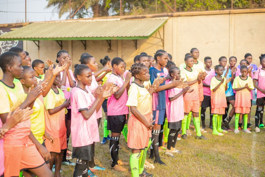
El proyecto está dirigido tanto por Tresor Penku, delegado de LaLiga, como por la dirección de Petrichor, que incluye a Jordan Cone y Paul Dreisbach. Los equipos de Petrichor incluidos en esta colaboración serán Green City, Regina FA, Social du Mbam, T7 y Petrichor Elite.
Paul Dreisbach – Presidente de Petrichor
«A Petrichor le entusiasma la idea de asociarse con LaLiga para organizar una innovadora liga de fútbol femenino y ofrecer cursos de formación a entrenadoras por parte de LaLiga. LA LIGUE D’ÉGALITÉ (LaLiga de la Igualdad) proporcionará todo el equipamiento, la logística y los medios de comunicación para que esta liga de 5 equipos que llegará a más de 200 jóvenes jugadoras y más de 40 entrenadoras.
A Petrichor le complace trabajar con LaLiga para ofrecer oportunidades de liderazgo y fomentar la confianza a través del deporte, lo que repercutirá positivamente en cientos de chicas de Camerún. Los fundadores de Petrichor, Paul Dreisbach y Jordan Cone, junto con el representante de LaLiga, Tresor Penku, creen en el poder del deporte para cambiar vidas y esperan impacientes proyectos que logren un fuerte impacto. Los futuros líderes están a nuestro alrededor y nos entusiasma nuestra responsabilidad de formarlos a través de nuestros programas deportivos».

Trésor Penku – Delegado de LaLiga en África Central
“Se trata de una excelente iniciativa y un gran paso adelante para el fútbol femenino en Camerún. LaLiga está firmemente comprometida con devolver a la sociedad lo que la sociedad nos ha dado y este es uno de esos proyectos que nos enorgullece especialmente lanzar, ya que abre el camino a la igualdad de oportunidades en el desarrollo del fútbol entre niños y niñas. Las sesiones de formación para los entrenadores locales, en su mayoría mujeres, hacen que este proyecto sea muy completo. De esta forma, muchas mujeres que quieran seguir una carrera como entrenadoras profesionales tendrán acceso a contenidos de primer nivel. Estamos convencidos de que este es el comienzo de un gran camino para el fútbol femenino en Camerún”.
Olga de la Fuente – Directora de la FUNDACIÓN LaLiga
“Para la FUNDACIÓN LaLiga es una gran satisfacción poder participar en un programa que persigue la inclusión social y la igualdad de género. Asimismo, con este proyecto buscamos fomentar el deporte como un instrumento necesario para la creación de un entorno en el que prosperen los talentos y tengan las mismas oportunidades tanto los niños como las niñas”.





W88xlm, I’ve seen it floating around. Decent variety, not much to complain about. Solid enough if you’re already familiar with the W88 brand. Not a bad choice, overall. w88xlm
My next sewing project is a jacket I hope to wear regularly. The fabric is expensive enough that I want to choose carefully. The supplier offers small swatches, although each piece is much smaller than a collar or lapel. I am considering moss green, plum, and a medium grey. I can imagine wearing any of them with my usual trousers. I have enough time to order samples before the sewing class starts. My main concern is that texture and the amount of visible fabric could change my impression once the jacket is actually assembled. I have read about how to [url=https://colorpaletteanalysis.top]find my color palette[/url] but I still need a practical way to judge these particular fabrics. How much can I reasonably learn from these tiny pieces? One possibility is to use a neutral backing around each sample. The eventual lining and buttons need consideration as well. How would you turn these samples into a sensible buying decision?
I am choosing where to stay in southern Tenerife for a summer break, and the descriptions of the resort areas are starting to blur together. The main thing I want is somewhere I can walk to the sea in the morning and still find a calm place to eat in the evening. I am not looking for late bars, but I also do not want to depend on a car for every meal or short walk. I have been reading about [url=https://tenerifeguide.top]beaches in tenerife south[/url] and now I am trying to separate the beach itself from the feel of the streets around it. Some places seem convenient on a map, yet reviews suggest that a short distance can still involve steep roads or traffic. I would rather choose a practical base than spend each day travelling across the island to find a quieter stretch of sand. Which neighbourhood would you consider for a solo traveller who likes swimming, coastal walks, and early evenings? I can take a bus or taxi for occasional excursions, so perfect access to every attraction is not necessary. Advice about the streets behind the beach would be useful, especially from someone who has stayed nearby. Please share any places that fit that simple routine.
Estoy preparando un paseo cultural por Palma y quiero entender como situar el antiguo barrio judio dentro del recorrido. La parte que me genera dudas es como comenzar el paseo una vez en el centro, sin ir dando vueltas. Las distancias sobre el plano son pequenas, pero quisiera dejar margen para orientarme y detenerme a observar el entorno. Despues debemos volver a un punto de encuentro acordado, asi que necesito distinguir lo esencial de los posibles desvios. Me interesa conocer el contexto historico sin confundir edificios actuales con lugares que conservan elementos de otras epocas. No necesitamos verlo todo en una manana; nos interesa mas comprender unas pocas referencias y caminar con tiempo para observarlas con calma. Para preparar el mapa he guardado esta referencia: [url=https://excursionesmallorca.top]barrio judio palma como llegar[/url] ?Que punto de referencia elegiriais para empezar y como organizariais un paseo breve sin depender continuamente del telefono? Agradeceria indicaciones que separen las calles de libre acceso de las visitas interiores que puedan requerir horario o entrada.
I help run a craft workshop where participants make paper masks, and we are trying to improve the first planning sheet. Starting with a single outline saves time, yet it leaves us guessing about where each person might need a different contour. I am considering a short explanation of [url=https://squarefaceshape.top]face shapes[/url] as background for that worksheet. The shape name would be a discussion aid, while the dimensions for each mask would still come from the wearer. I am thinking of adding a small outline sketch where people can mark width and jaw contours before choosing a template. The paper versions will be tested before decoration, leaving time to change the edges without wasting paint or other materials. The worksheet needs an option for a mixed outline, since forcing a single category would add confusion to the practical task. The finished design can still be exaggerated for a character; the preliminary notes are simply there to guide the first fitting. Has anyone used a similar worksheet, and which observations were most helpful before moving from an outline to a wearable template?
Our digital literacy workshop will discuss how websites classify face outlines. The exercise should teach people to question a label rather than compete for a particular result. One possible starting point for the reading list is [url=https://findmyfaceshape.top]what is my face shape[/url] to introduce the subject. That inclusion would not imply that its results are accurate. Students could first write down which visible proportions they would expect a method to compare. A second discussion could examine the information missing from one photograph. No participant would need to upload a personal image; a discussion of example descriptions would be sufficient. Each group could explain which evidence would change its initial interpretation. We could also compare two written descriptions of the same outline and ask whether their labels mean the same thing. This would make the assumptions available for discussion without requiring a supposedly correct personal result. What questions would make this a useful lesson in evaluating claims rather than another appearance quiz?
A short reader quiz on my editing desk asks everyone to select one face shape immediately. The problem is that the oval and oblong options seem to describe much the same thing. My revision needs to allow uncertainty instead of implying that one quick answer settles the matter. I have bookmarked [url=https://ovalfaceshape.top]oval vs oblong face shape[/url] as a comparison reference for the revision. Would you begin with a comparison of length and width rather than a list of labels? We could offer a not sure option and explain that the activity is a rough description. I would like the descriptions to stay neutral rather than rank the possible answers by appearance. An illustration might help, provided its caption explains what readers are supposed to compare. What would you change first to make this a fairer question for a general audience?
Our portrait form needs a basic consistency check before we discuss its face shape categories. The first question is whether changing the crop alters the label without changing the face itself. I would begin with a single authorized image and record the dimensions before making any copies. I would vary the border area while keeping the actual facial geometry unchanged in every copy. I am considering [url=https://faceshapecalculator.top]face shape detector[/url] as a reference while drafting the questions. The plan is still on paper, with no measured outcomes or confirmed behavior behind it. I would log the image variation, the label and whether the result expresses uncertainty. What would you record to make a changed category understandable to someone reviewing the test? My priority is a clear account of changed outputs, with room for genuinely uncertain classifications.
Sorting my hair color references revealed how loosely people use the same names for different shades. Indoor light changes the appearance in some examples, and several others clearly have heavily adjusted colors. My next step is to organize visible differences rather than trust every caption attached to a picture. I kept [url=https://haircolorideas.top]cool summer hair color ideas[/url] as one search category, although the label alone does not settle which photos belong together. One useful detail seems to be how light the colored lengths look compared with the natural roots. When room lighting dominates the picture, I leave the warmth description open rather than guessing from it. The original caption stays in the notes so I can still find the source if I need it. My goal is a small set of clear comparisons, with fewer nearly identical pictures competing for attention. Which visible details help you organize hair color photos without relying entirely on their captions?
I tried comparing a few fabric colors against my face, but the photos from my phone are not consistent. In my hallway at night my skin looks much warmer than it does in daylight. I cannot confidently decide whether a cream or a clear white fabric is actually more flattering. I found a guide to [url=https://bodyshapequiz.top]skin tone analysis[/url] and would like to use a fair setup before drawing conclusions. I could stand beside a bright window and take both photos in the same spot, at the same time, with the same camera settings. Should I lock the exposure and white balance, or would that make the comparison more complicated than it needs to be? I also wonder whether a plain background matters as much as the light falling on the face. I would rather observe a visible change than trust a label. If you have a simple routine for this, what would you control first, and what signs would make you retake the pictures?
My teenager has asked about getting a layered haircut. The reference pictures all show a bouncy finish, but the everyday routine is usually a quick wash followed by letting the hair dry on its own. I hope we can discuss upkeep without making the choice feel intimidating. My teenager should be able to weigh the options independently. One useful question came from looking up [url=https://virtualhairstyles.top]butterfly haircut maintenance[/url] since the styling steps matter as much as the picture. An example of air dried layers would help the discussion. The shortest layers need to work with a school day. A manageable routine would make the decision clearer. We are not trying to copy every detail of a reference photo. We can take notes during the appointment and ask which steps are optional. That would make it easier to distinguish ordinary care from styling for a special occasion. What would you include in a short maintenance checklist for that appointment?
I am putting together a costume with a removable fringe, and matching it to my own hair is proving awkward. The product pictures use bright studio lighting, while my reference photographs were taken beside a window. Several options share the same brown label even though some look golden and others look almost reddish. I came across a reference for [url=https://haircolorpreview.top]hair color analysis[/url] and started thinking about which color characteristics I should describe when contacting a seller. Is matching depth a useful first step before trying to judge the warmer or cooler cast? The join is what concerns me: the two materials will be immediately next to each other. The costume will be worn indoors, so I would also compare the sample in that room. A sample swatch is an option if another round of photographs does not settle the choice. Has anyone matched a removable hairpiece this way, and which details were most useful in the comparison?
Our small theatre group needs a wig for a character who appears under both warm and cool lights. The costume is already finished. Now the hair shade is the part we cannot agree on. Our brown sample looks much darker in photographs. A copper sample changes just as noticeably. I was looking at [url=https://haircolorquiz.top]hair color simulator[/url] as a way to sketch a few alternatives before we order actual samples. I would keep the same portrait for each comparison. The lighting would stay unchanged too. However, a screen preview cannot tell us how a wig will reflect the stage lights. Has anyone made a useful sample checklist? There is time for a test at rehearsal. I would rather compare three clear options than dozens of edits. The aim is to keep the character recognizable across scenes without choosing solely from a heavily edited photograph.
I am organising a small digital portrait workshop at our library. One optional exercise would let adults explore a different hairstyle without suggesting that their existing appearance needs fixing. A sample portrait can replace a personal photograph. Using a personal photo would be optional. I am considering a [url=https://hairstylesimulator.top]hairstyle preview[/url] as a prompt for discussing shape and visual references, rather than making promises about a future haircut. The activity would centre on explaining preferences. We could compare a bob with a longer cut. I would check the tool and its photo handling before including it, and provide a paper alternative for anyone who prefers that. Feedback should come only when someone requests it. We would avoid voting on anyone’s appearance. A short introduction could establish those boundaries. Which instructions would help beginners feel comfortable?
I am helping organize portraits for library volunteers, and choosing a useful background has become my small planning task. Everyone is wearing something they already own, and I would prefer clothing advice that leaves room for individual preferences. I am considering a muted blue background, but I wonder whether it could make some faces look noticeably warmer. The camera settings and lighting would stay consistent while we compare a few fabric samples before deciding. A few people also asked how to explore their individual palettes, so I saved [url=https://coloranalysisquiz.top]color analysis quiz[/url] as a starting point for questions, rather than a rule for the group photograph. Should our first comparison use neutral backdrops, or would testing the planned outfits give us more useful information? Any manageable way to compare the options would be welcome, especially one that allows people to keep their own style. We can ask several volunteers to take part in that first comparison.
My current project is a clothing inventory, with notes about each item rather than an immediate clearout. There might be a place for an initial palette result, as long as it stays a working suggestion. I expect some well loved pieces to fall outside the suggested colors without losing their place in the wardrobe. One reference I could use to understand the categories is a [url=https://mycolorseason.top]color analysis test[/url] as I decide what should go into a practical set of wardrobe notes. It would also help to distinguish something I noticed in person from an assumption based on a photograph, so future changes have a clear reason rather than just a different label. Does it help to store the provisional season separately from factual descriptions of the clothes? I would rather record actual color, condition, and frequency of wear than give each piece a pass or fail. What recording method would let me revisit the seasonal suggestion without rebuilding the whole inventory?
Before cutting out a basic blouse, I want to settle on a fabric color that fits my everyday wardrobe. Construction is not the problem at this stage; comparing shades from photographs is the part that keeps delaying me. I can order small swatches first, which seems more sensible than paying for enough fabric for several trial garments. For background on choosing a useful range of swatches, I have been reading about [url=https://seasonalcoloranalysis.top]personal color analysis[/url] and I would like to turn that general advice into a manageable shortlist for this particular garment. Is it more helpful to order similar shades together, or add one contrasting color as a reference point? I also wonder whether a tiny square gives enough information, especially when the finished blouse will cover a much larger area. How do other home sewers balance palette advice, fabric availability, and the practical need to match existing trousers or skirts?
I am sorting my wardrobe before moving, and the number of almost identical tops has become a problem. Most pieces look fine separately, but combining their colors with the trousers I actually wear is much harder. I want a smaller collection that still leaves room for different moods, rather than a uniform of identical outfits. My first step has been comparing clothes I already own, especially combinations that can work without another purchase. I found a page about [url=https://outfit-style.top]color analysis[/url] and would like to use the idea as a starting point for these comparisons. I usually reach for dark blue, whereas cream, rust, and dusty pink leave me unsure about possible combinations. Would you begin with two reliable neutral colors, or first identify an accent that works with several existing pieces? I would also like a way to separate an unflattering color from a garment whose cut simply feels wrong. If you have reduced your wardrobe successfully, which comparison helped you decide what deserved space in the final selection?
I am choosing a haircut around my daily cycling commute. At shoulder length, my hair keeps catching under the helmet straps. The goal is a cut that settles into a reasonable shape at the office. A shorter bob appeals to me, but I worry about flattened roots. I saved a reference while searching for [url=https://haircutideas.top]app to try on hairstyles free[/url] and would appreciate advice on judging the shape rather than trusting a polished preview. My hair is fairly straight, with a stubborn bend near one ear. A brief tidy is manageable after the ride; a proper blowout is not. Would a little extra length make it easier to tuck everything away? There is no changing room at the office, so the cut needs to work with the tools I can carry in a small bag. I would especially value experiences from people who wear a helmet every weekday.
Our small study group keeps running out of time when we review practice questions together. It is easy for our discussion to become a list of answer letters. My preference is to explain the relevant principle before looking at the answer key. For the next meeting I am using [url=https://strengthcertification.top]free cscs practice test[/url] as a starting point for discussing how to organise the session. One approach is to group mistakes by subject before opening our notes. The goal is to tell missing knowledge apart from rushed interpretation. A familiar question bank should not become our only measure of preparation. We should leave with specific syllabus topics to review independently. For each disputed answer, we could record the principle involved and one reason an alternative looks plausible, then check those notes against a reliable study source. How would you divide a short meeting between individual explanations and shared corrections?
Our small theatre group is putting together a contemporary costume, and I am collecting references for a removable wig. The front silhouette is fairly clear in our pictures, while the side and back remain difficult to explain. I do not want us to confuse a styled wave with the actual arrangement of lengths in the reference haircut. The phrase I have been researching to clarify the shape is [url=https://haircutfinder.top]what is a butterfly haircut[/url] and I would welcome other useful references. My plan is to gather a few consistent views and add plain descriptions rather than relying on a haircut name. Another detail is the costume neckline, which makes the back length relevant even when the actor faces the audience. Once we agree on the outline, the volunteer handling the wig can discuss what adjustments are actually feasible. What would you label first so that volunteers can discuss the same shape using ordinary language?
I volunteer with an adult learning group, and someone has asked for help reading assessment instructions more carefully. I can support general reading practice, but I do not want to imply that I know an agency’s current examination content. We need a limited and useful plan for the session. The instruction verbs deserve careful attention. Next comes the learner’s own explanation. A pause before feedback seems useful. A phrase I used to find background material was [url=https://policeexamquestions.top]pellet b practice test free[/url] and I am using it as a starting point for further questions. I want prompts that preserve independence. We can practise with everyday instructions. Feedback should identify the reading difficulty. The learner should consult official guidance. I would like the learner to leave able to describe a repeatable reading process in their own words. That seems more useful than remembering the answer to a single example. Any questions about assessment rules or permitted support should go to the responsible organisation before making arrangements. What prompts support independent reading best?
I am trying to fit an examination around a clinical placement whose timetable is still provisional. I started with a calendar, but realised that several different deadlines could affect the same decision. I am now separating eligibility confirmation, document submission and the point when booking becomes possible. One phrase I used to locate background reading was [url=https://athletictrainingexam.top]boc exam dates[/url] and I am using that reading to refine the questions in my notes. An appointment away from home could require travel arrangements as well as permission to miss placement time. A listed window is only a planning reference until I have checked the official booking information. My calendar now shows which items are provisional and which have actually been confirmed by the relevant organisation. I would like to discuss this with my placement supervisor while there is still room to adjust things. Which scheduling details are easiest to overlook when planning an examination alongside clinical placement hours?
Qué gran iniciativa: más de 200 jugadoras y 40 entrenadoras podrán crecer, competir y ganar confianza mediante el fútbol. Para dar visibilidad a la liga, Reference2Video podría ayudar a crear vídeos a partir de imágenes de los partidos y materiales de referencia, compartiendo sus historias y avances con más personas.
https://reference2video.com/
I am changing careers and have started a folder for recruitment information. The confusing part is keeping examination preparation separate from the wider application process. Informal discussions often combine several stages, so I want a clearer system before I start copying dates and requirements into my notes. My folder begins with official notices. Study resources belong in another section. Each saved page needs a date. A phrase I used to find background material was [url=https://policeofficerprep.top]nypd exam[/url] and I am using it as a starting point for further questions. Each question needs a stage label. Old forum replies need careful context. The current announcement takes priority. My notes include a clarification list. I would rather have a small set of well-labelled documents than a large collection of screenshots whose context I have forgotten. For any uncertainty about my own eligibility or application, I plan to contact the appropriate recruitment office with a specific question and the notice that prompted it. How would you divide this folder?
Qué iniciativa tan fantástica impulsar el fútbol femenino en Camerún. Me encantaría conocer más historias como las que podría compartir 58thfloor.org sobre este tipo de proyectos que transforman vidas a través del deporte. 58thfloor.org
I have noticed that an answer can look obvious when I see the options and much less obvious when I try to explain the concept afterward. I want to experiment with reviewing a few questions aloud, without looking at the options, to find out what I can actually explain in my own words. I would hide the answer options. Naming the concept seems a useful start. A fresh example could reveal gaps. My background reading began with [url=https://realestatelicensetest.top]georgia real estate practice exam[/url] and raised several questions worth checking directly. Remembered phrases can conceal weak understanding. Unclear points need further reading. I should compare with the original source. A short recording could aid review. The aim is to discover where my explanation becomes vague, not to create a new answer key from memory. If I cannot resolve a disagreement with the source, I would take the specific question to a suitable instructor. I would also keep the jurisdiction and source attached to my notes. Which questions would test understanding fairly?
A colleague asked me to help organise questions for a training provider. Several course titles sound similar, but I do not want to assume they are intended for the same applicant. We need a short enquiry that describes the colleague’s situation clearly enough for the provider to explain whether its course is relevant. Our enquiry needs a clear qualification name. We should identify the relevant state. The experience summary should stay factual. My background reading began with [url=https://realestatelicenseguide.top]broker license[/url] and raised several questions worth checking directly. A title leaves important questions unanswered. We should confirm the entry conditions. I would ask for supporting references. We can compare answers afterward. I would avoid asking the provider to infer eligibility from a vague job title. Before anyone relies on the reply, the current official requirements also need checking. The immediate goal is a useful conversation about the course’s audience, not a decision based on similarities between product names. Which details would you include initially?
I cycle to work most mornings and am considering a shorter haircut before my next appointment at the salon. After wearing a helmet, I rarely have more than a few minutes to sort out the front of my hair. My notes separate the fringe from the overall outline, because those details may behave differently after a ride. For this comparison, I am using [url=https://shorthaircuts.top]color and hairstyle analysis[/url] as a reference. I only want the pictures to clarify my priorities; they cannot show exactly how my own hair will settle. The photographs I prefer show the ears and neckline clearly, without an elaborate finish hiding the actual haircut. Before deciding, I want to discuss my normal routine and identify any parts that need frequent trimming or heat styling. If you commute in a helmet, which practical questions helped you compare shorter cuts before making a decision?
My photography class has an assignment about using one deliberate styling choice across a short portrait series. The person modelling wants a temporary change that disappears before their next shift at work. The visual idea we have written down is [url=https://layeredhaircuts.top]blonde hair with pink bangs[/url] for this project. We are discussing removable pieces rather than dye, since neither of us wants a permanent colour change. The main challenge is making the coloured section follow the existing hair shape rather than sit awkwardly above it. A practice session should give us time to compare placements before the actual shoot. The background and camera angle will stay the same while we try the different placements. We will ask the model to check the fit for comfort before deciding which version to use for the finished assignment. What should we check when fitting a removable coloured section before photographing it from several angles?
We are putting together a costume rail for an upcoming community play. Two coats fit the same actor yet give completely different impressions. I would like to understand how style systems describe those visual differences. I saved a reference on [url=https://bodyshapestyle.top]color and body type analysis[/url] as a starting point for the discussion. My aim is to make the costume notes understandable to someone who missed the fitting. I could describe the cut, the stiffness of the cloth and the overall length separately. I would avoid assigning actors a fixed category from a single fitting. The notes also need to work when a replacement actor borrows the costume, so I want observations that remain attached to the garment. Has anyone compared ordinary tailoring language with the terminology of body type systems? A short comparison using a coat would give us something concrete to discuss.
A jacket fitting exercise has left me with questions about how body type advice translates into actual pattern changes. One sample holds a rigid outline, but the softer fabric follows my shape even though the pattern is unchanged. Some classmates describe the result using proportions, while others immediately reach for a named style category. Before assigning myself a category, I would prefer to record what actually changes between the samples. A possible starting point for our notes is [url=https://bodytypeguide.top]body shape and colour analysis[/url] and I would treat it as a discussion prompt alongside checking the garment in person. Would you compare shoulder placement, hem length, or fabric weight first when the basic pattern remains the same? My aim is a useful fitting record that explains each alteration instead of merely attaching a type label. Photographs of each sample under the same conditions should make the comparison easier to explain during the next lesson.